![logo couleur-2.png]](https://support.appcraft.events/hs-fs/hubfs/logo%20couleur-2.png?height=40&name=logo%20couleur-2.png)
The different sections
Top of the page
MultiImage Header

This section lets you display a title and an image in 2 columns.
You can customize the location and size of the image in the section parameters.
HeroText

This section lets you integrate a large banner composed of an image and text.
The text content is directly editable.
The height of your banner can be modified via the height button in the section parameters.

You can also customize the buttons in the settings by entering urls for each button.
If you only want one button, please do not enter a url for one of the two.
You can change the image of your banner by integrating it in Background image.
Finally, you can choose the layout of your text, banner and buttons in the settings.
Hero Image

This section allows you to add a full-screen image to your mini-site.
To add the desired image, click on the section.
Page content
Image gallery and Carousel

These sections allow you to integrate images in different formats into your mini-site.
You can switch between them directly in the section parameters.
Image gallery
This section format allows you to display your images horizontally.
You can add a caption to your images by clicking on the Show labels button in your section settings. Then type the desired text under each image.

You can also set the spacing between each frame and the number of frames per line in the section settings.
Carousel
This section format allows you to display your images horizontally, with the photo currently being viewed highlighted.
You can choose to have your photos scroll automatically at the speed of your choice by selecting the speed in the section settings.

Alternatively, you may wish to display scanning arrows for your participants, rather than have the images scroll on their own.
In this case, select Autoplay: None, then check the arrow display box.
Partners

This section lets you display all your partners in horizontal view on your mini-site.
You can also add links to their websites. On the participant side, their logos will be clickable.
You can customize the display and number of partners per line in your section settings.

Video

This section allows you to integrate a video into your mini-site.
To embed your video, click on the table icon at the top right of your section, then insert the url.
You can customize the positioning of your video in your section settings. Depending on positioning, you can insert a text insert.
If you have a section of text, you can align it as required in Vertical Alignment.
-png.png?width=688&height=376&name=Capture%20d%E2%80%99%C3%A9cran%2c%20le%202023-06-22%20%C3%A0%2010-34-36(1)-png.png)
Information

This section allows you to integrate a gallery of practical information in horizontal view into your mini-site.
You can customize the design of your icons and the number of icons per line in your section settings.
Access

This section allows you to integrate a Google Maps map (zoomable and clickable) of your event location, accompanied by a block of text.
To modify the address displayed on the location map, click on the table icon at the top right of your section, then edit the address directly in the dedicated text field.
You can customize the position of your map in your section settings.
Image and text

This section lets you add an image and a block of text.
You can customize the size and position of your image, or add shadows to suit your desired rendering in your section settings.
Text with shaped image

This section allows you to have several images integrated into a block of text.
You can customize whether to have one or two images and the desired shape of the images in your section settings.
Program

{height="" width=""}
This section allows you to insert your program in text format on your mini-site.
If your event takes place over several days, click on the Add element button at the bottom of the section.

You can customize the positioning and size of the image, as well as the program template, in your section settings.
Vertical timeline

This section allows you to present your program on a timeline.
You can illustrate the description on the opposite side to the text map, or by placing an image above it.
You can customize the size of the images in your section settings.

You can retain the display of buttons or not in text blocks by checking or unchecking the functionality in your section settings.
Text with button

This section lets you add a block of text with a button to your mini-site.
To customize the url behind your button, click on the table icon at the top right of your section, then fill in the slug of the page on your mini-site to which you wish to redirect.
To customize the background image, click on the table icon at the top right of your section, then enter the url of your image.
If you leave the url blank, the background will be a solid color.
To obtain the hosting link for your image, send the image to your project manager so that he can generate the link for you to insert.
Text

This section allows you to insert multiple text blocks.
To add a new block, click on Add element.
You can customize the formatting of your text using the edit bar, which will appear automatically.
In this section, you can also customize the background image. Click on the table icon at the top right of your section, then enter the url of your image.
If you leave the url blank, the background will be a solid color.
Cards

This section lets you present text in up to 4 columns.
Text can be presented as a map, text or text with URLs. You can also associate images with the text, which you can resize.
Contact

This section lets you add a contact form to your mini-site. Your participants will be able to use this form to ask any questions they may have.
To receive form submissions, enter the e-mail address to which you wish to receive them in the cogwheel tab, then Contact e-mail.
You can add an image and customize its position in relation to the form in your section settings.
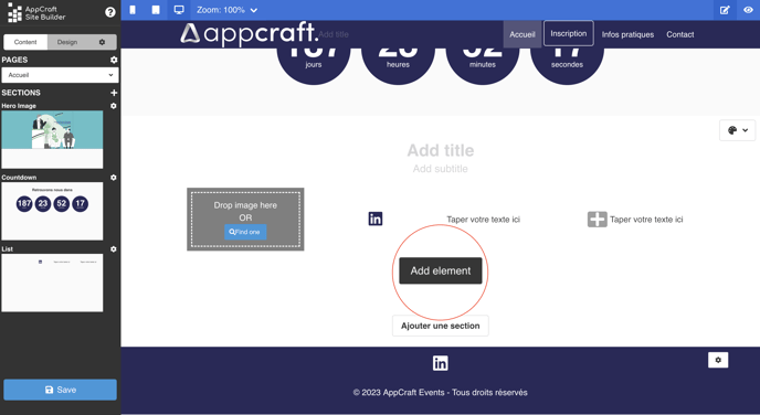
Countdown

This section lets you add a countdown timer to your mini-site.
Click on the table icon at the top right of your section to enter the date on which your countdown is to be based.
You can customize the color of your countdown digits in your section settings, by inserting the desired hex code.
Your main color is applied by default to the background of the numbers.
You can customize the shape of your countdown.
Finally, you can customize the text for days, hours, minutes and seconds by inserting the desired text in the dedicated inserts.
Dynamic content
Workshops
-png.png?width=688&height=377&name=Capture%20d%E2%80%99%C3%A9cran%2c%20le%202023-06-22%20%C3%A0%2014-04-57%20(1)-png.png)
This section allows you to display your schedule directly from the data you've added in your back-office Agenda module.
If your agenda sessions include conditions, these will also apply to the mini-site if it is accessible to participants via their private link.
In the case of a mini-site open to all, the conditions will not apply.
You can customize the display template, the date display format and the number of workshops per line to be displayed in your section settings.-png.png?width=688&height=376&name=Capture%20d%E2%80%99%C3%A9cran%2c%20le%202023-06-22%20%C3%A0%2014-11-17%20(1)-png.png)
You can also choose whether or not to display filters, speakers and details of your sessions by checking or unchecking the dedicated boxes.
Display options are also customizable.
Speakers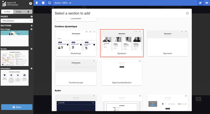
{height="" width=""}
This section allows you to display your speakers, directly from the data you've added in your Speakers module in the back-office.
All your published speakers are displayed by default; if you wish to display only a part of them, click on the table icon at the top right of your section, then Choose on Speakers to display. Select the speakers you wish to display.

You can customize the display of your speakers in your section settings.
Sponsors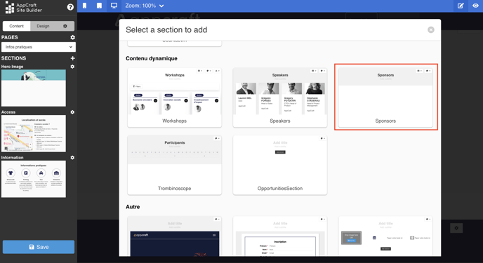
{height="" width=""}
This section allows you to display your sponsors, directly from the data you've added in your Sponsors module in the back-office.
This section functions and can be customized in the same way as the speakers section.
Trombinoscope

This section allows you to display the list of your participants on your mini-site. The data is transferred automatically.
When you add this section, it's normal for your participants not to be displayed.
Your participants will only be visible on your mini-site in real-life conditions, outside the editor.
Opportunities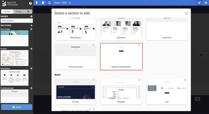
{height="" width=""}
This section allows you to display your opportunities directly from the data you've added to your Opportunities collection in the back-office.
Others
IFrame

This section lets you integrate iframes into your mini-site.
An iframe is used to integrate the content of one page into another.
To insert your iframe link, click on your section settings.
Register

This section allows you to insert your own form into the mini-site.
In your section settings, choose the form to be displayed from the drop-down menu, which will display all the forms you've created.
List

This section allows you to combine possibilities according to your needs. The section will be presented in the form of a column, the number of which you determine. You can add elements of different kinds by clicking on "Add element" :
- image
- text
- icon and text
- social networks (create a block with all the links you want to your social networks: play store, apple store, linkedin, facebook, twitter, instagram, youtube)
Mobile Apps

If you have an application on the stores in addition to your mini-site, this section allows you to add links to your application.
To add links, click on the table icon at the top right of your section, then insert them in the dedicated inserts.
Separator
In the options for each section, you'll find a separator insert.
This insert lets you customize the bottom of each of your sections, the type of separator between each one you want.
You have 7 possibilities, or the choice of keeping a classic, straight separator.